Trees Complete

Following on from the last blog, I twiddled a bit with the torn scraps of painted Lutradur that I was layering on the right hand tree. A certain amount of pinning, looking and re-pinning went on at this stage.


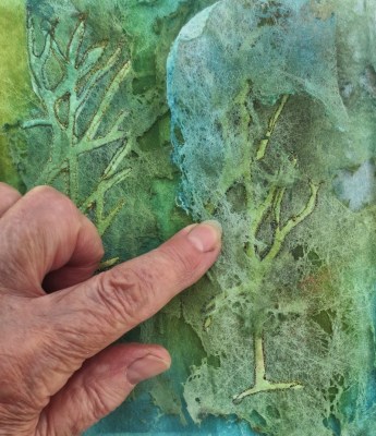
Straight stitches were worked lightly over the trees to anchor the scraps of Lutradur down. A little extra sheer fabric found its way around the base of the trees to anchor them.


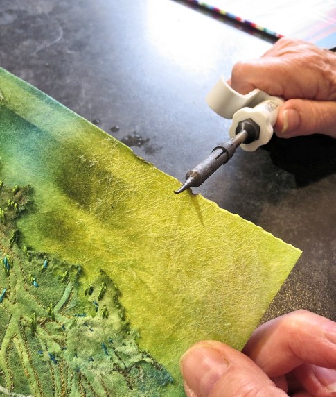
I ironed the back of the central crease very carefully, just so that it would ensure that the right-hand tree stood proud of the surface. It was a bit of a worry that the Lutradur might melt (which would be a melt-down in more ways than one). Then the edges were darkened (and very slightly burned) with a soldering iron. Craft Vilene reacts well to this treatment.


There we are – all done. I really loved making this piece – think I might start a forest.


A Brave Move


Following on from yesterday, I was quite pleased with the story so far but I felt that the trees needed more shape. So I bravely tore a little of the Lutradur away from the tree on the left. This gave it a better shape and I could see how some stitching would help to enhance it.


It also showed more of the background. However the tree on the right now looked a bit shapeless.


So I tried placing the torn off strip of Lutradur over the top and suddenly it was in full leaf.


Looking at the piece as a whole, I now thought about giving it a fold in the middle to bring the trees closer together. I tweaked the overlay on the right hand tree and resisted the temptation to do any more in case I tore too much away.


A little of the torn bit could also go on the base as some undergrowth with further stitching. I need to worry away at the left hand edge too – more tomorrow, folks.

Corona Challenge – Part 2

Today I am continuing the challenge to choose six items from the cupboard – see yesterday’s blog:

Pressure Stencils – a technique that I’ve used a lot on silk but this time I’m working  on Vilene. It gives a less sharp effect but slightly fuzzy can be good, so off I went
The piece of Vilene was placed on a black plastic bag, sprayed with water and then sprayed with Adirondack paints and Brusho – any strong colour will do. It needs to be thoroughly wet. 

Then the stencil was placed on it and kept in contact by placing some objects on top to hold it down. Nothing too heavy should be used or the colour will migrate (although this can be interesting). Leave to dry without peeking. See pics below.


The Vilene worked really well: I love the burst of yellow at top left – looks like the sun peeking through the trees. This piece could be worked just as it is with hand or machine embroidery.

However, I was on a roll with the shadow stuff so another Vilene tree was cut out (see yesterday’s blog) using the stencil as a guide but concentrating just on the central portion. Then a piece of the finer Lutradur 50 was wetted and sprayed lightly using the same blues and greens as before but adding just a touch of terra cotta colour. I’ve used sprays but it doesn’t really matter – paints or Brusho would be fine. See below.


The tree cut-out was placed on the background, moving it around until it achieved a harmony with the shadowy pattern elements of the background (see below left).  When the Lutradur piece was dry, it was placed on top, forming the top layer (see below right). I used FuseFX to bond the two layers together before machine embroidering around the trees. 


Finally (I couldn’t resist it) I used a heat tool, just a little to show more of the background.  That is it for today – more tomorrow, folks. 


Corona Challenge

Below you will find a workshop that I wrote for the last Workshop on the Web – before we turned it into the WOWbook. It seems appropriate to offer it again at this time when we have more time for some stitching fun. Here it is – take up the challenge – you can use my six ingredients or choose your own.

I thought it would be fun if we all selected six of our favourite ‘ingredients’ from the stash’n’store treasure trove and see how they might be put together in different ways. I’m not suggesting that you use all six in a single piece of work – just have a play and see what happens. I am also just showing techniques, not finished pieces: that’s part of the challenge.

  • A Stencil – plastic is best
  • Lutradur 70
  • Lutradur 50
  • Water-soluble paper – there’s a surprise
  • Vilene – the usual, S80 – obviously
  • Paint – I’ve used a variety

Shadow Work

I have always loved shadow work – the technique where you trap a shape or use a void between two pieces of fabric. This is a variation based on Lutradur. The piece of Lutradur (70) was placed on baking paper and damped with a brush of water.

I didn’t want it too heavily coloured so Koh-I-Noor paint seemed a good candidate for the job and I mixed it with plenty of water. (Lutradur always knocks back the colour in the paint anyway.) This was then left to dry.


The next step was to place the stencil over S80 Vilene and draw in the shapes with a brush pen to give them slightly more definition. These shapes were then cut out with small sharp scissors. Pay attention to where you are cutting so you don’t lose lumps of the stencil.

I cut away the base of the tree to leave the trunk. The plan was to trap this shape between a layer of Lutradur and a backing fabric, yet to be decided.


After trying various painted and printed backgrounds, none of which pleased me greatly, I finally settled on newspaper. I crumpled a piece of newsprint which had a good mix of text and colour (what passes for a fashion page in our local paper) and laid it on felt as a good base for stitch. Crumpling the paper makes it soft and raggy and less likely to tear.

I placed two of the tree cut-outs on top of the paper and fused the Lutradur over the top. Take care with the heat of the iron, you don’t want the Lutradur to crumple.


As you can see below, this gave a good effect and now my task was to add simple hand stitching to highlight some (not all) of the branches. I also tacked the outer area, beyond the stitches, to hold it down so that straight lines of machine stitch could be worked. Without tacking, the stiffness of the Lutradur causes it to buckle.


Further lines of straight stitching were completed and will probably be enhanced with hand stitching between the rows before the edged are burnt. You can see the finished sample at the beginning of this post.

Tomorrow I will post about the next stage in the challenge.


The Great Brockenhurst Bit swap

The new WOWbook (number 5) is going down well and the members’ Facebook page is already showing some of the lovely work they have been making. This piece by Wendy Burgess is based on the section by Mary McIntosh. The title Life’s a Bleach will give you a hint of the fact that it is based on discharge techniques. Wendy Burgess used one of the techniques for this super piece, shown on the members’ page.


Also on the theme of WOWbooks, my Beyond Stitch group have been working through some of the ideas from Marian Jazmik’s piece in WOWbook 2. We all have the books so it seemed like a fun idea to work as a group, although choosing a workshop was not easy. I hadn’t tried Marian’s technique, with a fabric called Dipryl, before and it was good fun. I’ve trapped sisal (in my case, a piece of deconstructed rope) between layers and then stitched lightly before tearing it into strips and layering. The pic shows the result, with the addition of some water-soluble paper stamps and a motif stitched on soluble film. Quite how I am going to stitch it all together without flattening it will be a challenge.


I am very excited about the Brockenhurst Show (in the village of Brockenhurst, New Forest, Hampshire) this year as we are featuring The Great Brockenhurst Bits Swap. I expect that many of you have got lots of technique samples, experiments, failed backgrounds, and our idea is that these can be brought along and swapped for other people’s treasures. The photo below shows some of the bits I will be using to demo at the show. These come under the ‘borders and motifs’ heading.


In this pic, I am starting to put together a background and some borders.


I am really hoping to be able to make this little icon sample into a bigger piece with the use of a background and some borders.


Betty Ruffell and I will demonstrate ideas for putting the bits together to make new work. We will be dividing all the offerings into focal points, borders, bits and backgrounds and so on. We will also be showing ideas for making new focal points and borders (these are usually needed) and building up the piece. Motifs are also useful, so we will look at those, too.  The piece below is one of my own ‘bit-building’ efforts. Here I picked two stitched samples – the tree and the apples – and combined them with some paper printouts that were crumpled and then stitched to make strips and edgings.


We will also be showing ideas for making new focal points and borders (these are usually needed) and building up the piece. Motifs are also useful, so we will look at those, too. If you have recently had a workroom clear out and would like to send us some of you ‘bits’ (we will be hoping for some charity donations for swaps) contact Fiona and she will tell you how.  fiona.d4daisy@nullgmail.com

Find out more about the show on  http://www.brockenhurstfiesta.co.uk/ Come and join us – bring out your bits!

Saturday 25th April, 10am to 5pm  Sunday 26th April, 10am to 3.30pm


WOWbook 05 is here

It’s here. WOWbook 5 is a real cracker of a book, bursting with ideas. Folk tell me that they love the fact that the artists in the book not only share their working methods but are generous with ideas for taking the work in other directions. In doing so, they enable you to fit the ideas to your own way of working, with your own favourite subjects. I’m working on a new series of sketchbooks and I can see just how to make use of the Alice Fox method of making botanical inks,


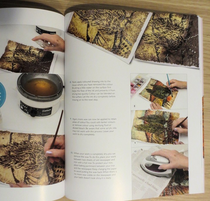
I’m also going to try some of Jenny O’Leary’s batik ideas (see below) with my long-standing obsession with wall paintings. That is just for starters. You can see a full list of the artists on the home page.


I shall never forget driving up to interview Jean Draper and pick up her work for the book. I always prefer to talk to artists face to face for these interviews and, with Jean, a visit was essential as we felt it better to pick up her Forbidden installation, rather than trust it to a carrier. Jean’s house is a treasure trove of art as she is a serious collector and has some wonderful pieces. I had only just started my City and Guilds textile course when our tutor organised a trip to see an exhibition of Jean’s work in Bristol. Her figurative series featuring Indian scenes showed me that textiles could portray images in the same way as paintings – I came to stitch through the drawing and painting route.


It was the distressed books exhibit, Forbidden, that I really wanted in the WOWbook. Clive and I saw it in a Textile Study Group exhibition and it made a very deep impression on both of us.


For me, the strength of the WOWbooks is the additional resource of the Members’ Club and the Facebook group for sharing ideas. This time, to start us off with a great ‘how-to’ workshop, we have our WOWbook editor, Lynda Monk, talking us through techniques for design transfer, including foiling, bonding, encaustic wax transfer and much more.

We also start you off with two videos – Lynda speaks to textile artist Sharon Osborne about her work and also shows us shows us a great transfer printing method.


We are all looking forward to hearing what you think of the latest edition and seeing some work in the Facebook group.


The Best Laid Plans

It’s funny how textile pieces change as you work on them. A week or so back, I posted on Facebook a progress report of ways of translating a computer design. This was originally a pastel drawing that I put through a Displacement map on Photoshop Elements.


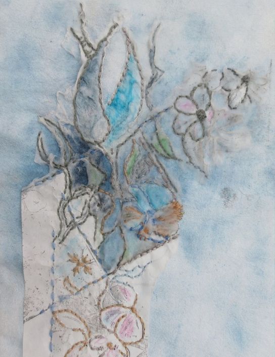
One of the experiments involved in translating this to stitch was a method of hand stitching on rubber-stamped water-soluble paper. I placed the stamped design onto painted fabric, did some simple hand stitching and then dissolved part of the paper.


This led on to other trials and the whole project graduated to my ‘thinking board’.  This is where I pin things that might become a series. I always find that the pinning method generates ideas. My workroom is also a main route to our back door so I pass through frequently and stop to move things about. The board contains all kinds of samples that link by colour or theme and  might become part of a series one day.


It had now become enough of a compulsion to make a new piece for a background, so I worked on Craft Vilene, covered with a layer of gesso. Some cut-out shapes were pressed into the gesso and a palette knife was then used to apply a little Fibre Paste Texture Gel in between the shapes. When dry, I painted it with black Quink ink which gives a different shade of blue or grey according to whether it’s a gesso or gel. I left a few spaces for some pale yellow water colour, which I applied when the ink was dry.

You can see these steps below. The final piece, below that,  shows that some of the shapes have been lost, which makes for a good background.


I thought I’d found my technique for the translation of the design – planned to cut it into strips and combine it with the water soluble paper stitching.


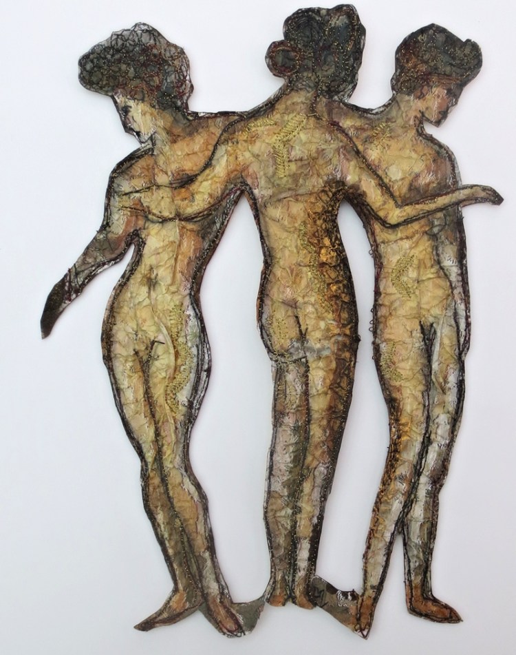
However, I then tried a (recycled) cut-out piece of stitching, featuring The Thee Graces on top and loved the result when I placed them on the background.


I’ve got just the frame for it, too. Oh well. I’ll just have to make another one for the displacement map.


Doing a Carole with Watercolours

I recently wrote a review of Carole Robson’s latest book Painting Expressive Landscapes

(Search Press, details at end of blog) As it was written for the website of the WOWbook, it wasn’t generally available. However lots of people asked me about it (after I posted on Facebook) so I decided to write about it here.


When I review a book that really grabs me, I tend to do a little workshop based on it for the WOWbook website – huge fun for me and a chance to see how something like a book on watercolour techniques can relate to textiles. As my current work has been an exploration of print techniques and image program designs on fabric, it’s a great chance to explore that aspect as well. The partly stitched piece shown here illustrates it.


Watercolour effects translate beautifully into textile designs, possibly using silk paints on fabrics. I like to use watercolour directly on paper and then scan and print on silk or cotton. This book on landscapes is ideal, as many of the finished pieces offer ideas for further embellishment. The suggestions and techniques may not be new to any of us from a City & Guilds or art-based background but I like the way that Carole combines them and her instructions are clear and helpful.

The book begins with the usual introduction to materials and basic techniques. We cover a lot of ground, moving swiftly from the absolute basics of mixing paint, dropping paint on wet paper, the infinite variety of pigments etc., then colour and tools (I love the spread on ‘painting without a brush’) and the techniques section where the action hots up. These range from some of our well-loved methods such as cling-film over wet paint, flicking paint from a brush and the use of salt. I loved the idea of drawing with a tube of paint, making use of the dried up stuff around the top. This gives a really bright pop of paint.


In the workshop I wrote based on Carole’s ideas, I was excited by the possibilities in manipulating the cling film to suggest elements of a landscape. This resulted in the sample shown below. A single colour was used (my favourite Nordic Blue) to produce a great interpretation of an overgrown forest. It was painted on heavy watercolour paper with quite a wet wash (see sample below).


This led to further experiments with additional colours. I outlined some of the shapes with a graphite stick.


How to incorporate the paper samples with stitch? I like inkjet printable fabrics by Jacquard and keep a small stock of the silk, cotton and organza packs. It’s not the cheapest method, but I fund it by filling the entire page with images and using any left-over bits for cards, which I sell at shows or use as birthday cards for stitchy mates. The resulting print is lightfast too, which is important if you sell work. In the pic below, you can see the original artworks, together with prints on both silk and organza.


I leave the prints overnight, before fixing them to a background fabric with fusible webbing, such as Bondaweb. I bonded the two stitched pieces shown onto felt, as I like the slightly quilted effect that this produces when stitched.


The tree was lightly free-machined with a few squiggles to suggest branches and a light outline of the trunk – it needs a bit more work as it looks a bit like a lollypop at the moment. I have begun to add more foliage with hand stitching in blue-green colours.

I always enjoy the experience of trying out ideas from books and appreciate the fact that Search Press are happy for me to do this. I took the book in to my stitchng group and everyone was impressed. We are going to have a ‘Messy day with Carole’ for our next meeting.

We have many extra workshops, by well known textile artists, in the WOWbook Members’ clubs on this website – so you don’t just buy the WOWbook but an ongoing experience.

Here’s the details about the book.

Carole Robson

Painting Expressive Landscapes

Carole Robson

ISBN: 978-1-78221-553-0

£14.99

Search Press www.searchpress.com


Here comes the next one…..

What an exciting time – WOWbook 04 should be with us next week and it is a real cracker. To keep the concept fresh, we introduced a guest editor, Lynda Monk, and she has discovered some truly innovative artists for us. Here are just a few of the exciting workshops:

Wendy Dolan knows a thing or two about keeping a sketchbook. In her workshop, she demonstrates just how to turn a quick sketch into an exciting piece of art. She shows us in detail how to transfer a design and then add texture and stitch to make a dynamic piece of art.

Many years ago, at the the now lost  (and much lamented) Art in Action show, I was introduced to the art of collagraph by one of the demonstrators – Sue Brown. I loved her work, she is mistress of so many techniques and she has remained one of my very favourite artists. She’s also had a big influence on my work. So what a coup by Lynda to have signed her up for a workshop, using gum arabic as a print device – see below. Genius.


Amanda Hislop is another featured artist and you’ll all love her ideas for building up a surface. These could be carried into all manner of textile and artworks.


Our interview is with Sandra Meech and, as you would expect, it is a fascinating account of how she approaches her work and what it means to her to be able to explore a ‘sense of place’, not only in her studies of the wild places of the world but also following a fairly recent move to Somerset in England’s West Country. Sandra has also written a very comprehensive workshop for the website that is free with the book. This will be waiting for you when you receive the book – where you will find all password details for our members’ club.


We also have articles from two famous Annes – both giving ideas for working in three dimensions. Anne Hellyer has introduced the concept of three-dimensional art with a piece that looks as good at the back as it does at the front. Her stand at shows is always packed with fascinated onlookers.

Our other Anne is Anne Kelly who has written some amazing books that we know you all love and she has, typically, been thinking outside the box for her workshop. Inside the box too, as she is converting a vintage workbox to a piece of high art, with some beautiful examples of stitch.

Then there is the ‘Inspired by’ feature and, on the website, the next instalment of my ‘Maggie Grey’ course – lots of experiments with texture and form in that. Tyvek, Lutradur, lots of mess and even lots of stitching this time.

To put your name on the ‘Let-me-know’ list for the book just email fiona.d4daisy@nullgmail.com


A Great Idea

I’ve just uploaded an article in the members’ club on the WOWbook site (www.wowbook.d4daisy.com)  about the fAB group of stitchers at Bicton College in Devon. This group members not only support each other in producing their own work but also mentor current students in many ways. Gill Burbidge is the tutor for a Level 3 (A-level equivalent) drawing, painting and fibrecraft course. She found that, when they finished the course, the students wanted more. Thus the fAB group came into being. The group donate money from exhibition sales at the college and this is used in many ways. Perhaps to sponsor stands for students at exhibitions, to purchase student work or to exhibit at shows, the purchase of props, lighting, end of year prizes, visiting speakers etc. The piece below is by former student Caley Bright.


There is also a shop where students can purchase all manner of stitchy needs at reduced prices. fAB members also help students at shows – doing anything from setting up the stand to paying for stand fees and display materials. This pic shows work from the recent Craft 4 Crafters exhibition.


This is such a good idea and a great way of encouraging young textile artists. Like-minded people can apply to become members of the fAB group. Contact Gillian for more details. Gillian.burbidge@nullbicton.ac.uk

feltmakersatbictoncollege.org.uk


A couple of things on my mind, one is the fact that the Gathering Memories project, which invited textile artists to submit work to be auctioned to raise funds for the Alzheimers Society, raised over £7,000. Such a great achievement and I know that a lot of people worked very hard to bring about this excellent result. This piece is by Sandra Meech.


I’ve just been reading an article from the Sunday Times magazine (yes, it often takes me a whole week to read the Sunday papers) about a very courageous woman with Alzheimers. She gives off the most upbeat vibes, while not belittling the difficulties, and has written a book. Sorry this is such a long link. https://www.alzheimers.org.uk/dementia-together-magazine/feb-march-2017/woman-alzheimers-who-wants-people-affected-dementia-fight


I dropped off my work for Ramster Embroidery Exhibition on Monday. having finally finished and framed ‘Raschida’, below. From what I could see from the work being unpacked, it all looks fantastic. I always do the eyes first these days – to see if I like how they look at me. I’ve worked a couple of ‘faces’ who have glared at me all through the stitching process.The exhibition starts on Saturday – here is a link with details www.ramsterevents.com/whatson